I saw this with your submission to Emotion and I very much enjoyed reading through it. The rock tone throughout the shrine was quite refreshing to read. The only problem I have is most of the layout seems to be cut off and hiding in the side of the page. Other than that I love it!
Would you like to exchange links with Seasons Change and Righteous Heart? :)
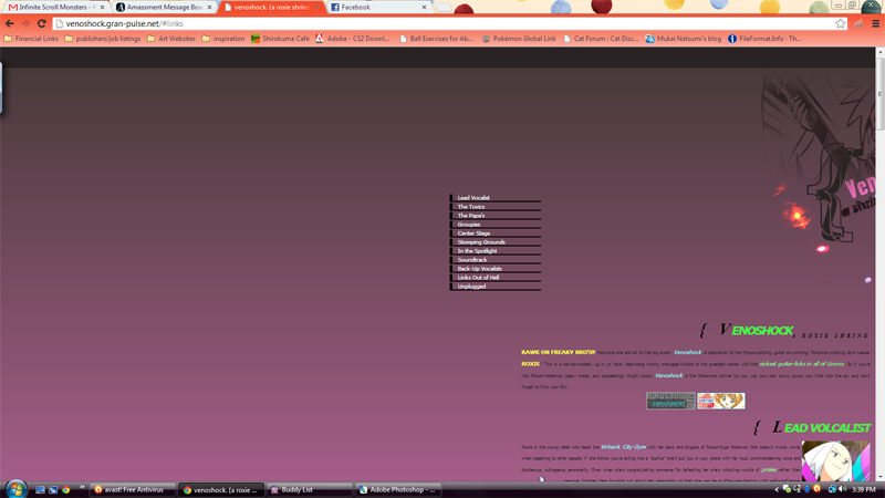
Venoshock: Up!
Forum rules
The usual guidelines in Constructive Criticism apply, and you have the option to flag your topic as "Sweet".
The usual guidelines in Constructive Criticism apply, and you have the option to flag your topic as "Sweet".
Re: Venoshock: Up!
What a fun tribute! I really enjoyed your writing. :) I especially liked all the references to rock groups as well as the "Soundtrack" section. The only problem I had was the same thing Crystal mentioned - the layout image is cut off. (I checked in Chrome and Firefox and it's doing that in both browsers.) Aside from that, though, it's awesome!
If you're interested in time travel, meet me last Thursday.
Re: Venoshock: Up!
I love how you organized it! Looks great! :D Also, your choice of verbiage and how it's written is great, too! I especially love the "Soundtrack" section! I think that's a really creative and personal touch. (I love "Rebel Yell" and think it suits her perfectly, too!)
A couple visual things: I'm using Chrome and it looks like the image is cut off and the font size is really tiny. :( Here's a screencap so you can see what I mean: http://i60.photobucket.com/albums/h22/b ... 855970.png
I'll add all your sites to mine when I get around to it! ^_^ (You're inspiring me to try and do that re-vamp to my Meowth shrine!)
Re: Venoshock: Up!
I'm not completely sure but this line here under #main could have something to do with it width:300px;. Try making that bigger and see if it fixes anything.
Re: Venoshock: Up!
What Crystal said. Somehow your #main div is getting a width of 300px and that's affecting how the image is rendering. Try making it 738px instead, so it's the same width as the image. :3
Re: Venoshock: Up!
Looks great. I didn't know Roxie's band mates name and now I do. I learned about Roxie today. She's pretty interesting. Also I like the soundtrack list too. Billy Idol is so cool....as long as he isn't singing Christmas songs.
;o; *** pew! pew!
Re: Venoshock: Up!
Working for me now, too! It looks great, Amanda. :)
If you're interested in time travel, meet me last Thursday.
-
dubiousdisc
- Administrator
- Posts: 2535
- Joined: Thu Jun 21, 2012 5:49 pm
- Contact:
Re: Venoshock: Up!
Haha, such a fun page! Awesome job.
As for the layout and your concerns about the color combination, I think it fits, but if you want to play with it a bit more, I'd recommend taking a screenshot of the layout as it is right now and playing with some color adjustments or layer modes and see if it results into something that you like better. That's how I solved problems with one layout whose colors were so bright that I couldn't put them together :P
As for the layout and your concerns about the color combination, I think it fits, but if you want to play with it a bit more, I'd recommend taking a screenshot of the layout as it is right now and playing with some color adjustments or layer modes and see if it results into something that you like better. That's how I solved problems with one layout whose colors were so bright that I couldn't put them together :P
Re: Venoshock: Up!
Much better! It looks pretty cool. :D I've gotten you added back as well! :D012789 wrote:Done! Thanks guys, let me know if it worked. Also, I added your links Crystal