Page 1 of 2
Flight + Rock Steady
Posted: Fri Sep 23, 2016 5:55 pm
by Destinie


Special thanks to
DubiousDisc and
Sofia for these banners!
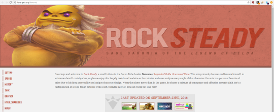
My Cooro shrine was long overdue for a new layout and some overall love and affection. I gave it a new layout and worked hard on upgrading the code and generally cleaning it up. I also went through and edited some typos and grammar. Same for Rock Steady, which had a new layout just this past spring, that I wasn't entirely in love with. Overall, I think both designs are similar but should provided a better reading experience.
Please let me know if you find any typos or anything I need to fix. Thanks~!
Re: Flight + Rock Steady
Posted: Fri Sep 23, 2016 9:06 pm
by Crystal
Ahhh I love what you did with both of them. <3
Re: Flight + Rock Steady
Posted: Sat Sep 24, 2016 6:58 am
by Laura
I love the improvements you've done for both shrines! They look so lovely and professional, very modern and up to date. I love how large they both are; I'm a huge fan of layouts that fill more of the empty space in browsers and I love that you made them scale depending on browser resolution. <3
I don't think that they look the same at all; the layouts on both shrines are very different, as are the font choices and other design elements. :)
I really, really love your Cooro shrine though! You have a lot of unique information in the series section that I've never seen before, namely the links to the different volumes. I can't remember if you had this on your site before your revamp or not (I think you did) but I had to point out how much I like that you try to make it easy for someone to pick up the series. :)
And the navigation! I love that you use a typical navigation bar, but then use subtle drop downs with button links. So unique! And the little round buttons/icons for navigation in the footer... ahhh, you did such an amazing job, I love it. XD
The only issue I see with Rock Steady is that the aspect ratio of the header image changes depending on the browser resolution; it's a bit stretched on my widescreen monitor. D: Otherwise, you did an amazing job on the reading experience for both shrines. <3 Eeeeee~
Re: Flight + Rock Steady
Posted: Sat Sep 24, 2016 10:00 pm
by Robin
Gorgeous! Flight's pictorial, bright layout is so welcoming and artsy, and Rock Steady's full-screen, organized layout allows you to see the depth of the site at a glance. Definitely going to take a deeper look when I have time tomorrow ^O^ congratulations on these beautiful revamps!!
Re: Flight + Rock Steady
Posted: Mon Sep 26, 2016 12:32 pm
by dubiousdisc
Aaahhhh!
Flight: So cute and playful :D The layout fits the character perfectly! I love the headings :D
I report one bug! When I click on the arrow to send back to top it just...behaves erratically. It jumps all over the place and then the menus become unclickable. ?? ??
...I realize now that I fucked up when I made that banner for you and I wrote Anima+ instead of +Anima, so, uh, ...can I fix that banner for you? XD
Rock Steady is excellent! Yellow goes well 8) But yeah, same as Laura, you might want to have a maximum width because on this big screen the content box kind of goes everywhere.
Re: Flight + Rock Steady
Posted: Mon Sep 26, 2016 1:04 pm
by Megan A
Ahh, both of these revamps are so nice! The layouts are both super clean and makes the content easy to read.
Flight: Flight is so happy and bright, and it really fits what I assume to be the character. I love how the navigation works! ALSO THE LINK HOVERS are so shiny and you use the same one for the buttons. I love how it pulls together the whole design.
Rock Steady: Love the red and the layout! I am really glad to see you're using his Hyrule Warriors artwork. To echo Laura, the header is a little bit stretched out for me as well. I took a
screenshot for you so you can see what we are seeing!
Congratulations on the revamps! :)
Re: Flight + Rock Steady
Posted: Mon Sep 26, 2016 3:32 pm
by Megan
Of course everything looks awesome!! I am so glad to see you revamping some of your babies! It's a great feeling to get out more/updated information and a new style!
I really like both of the layouts but I think if I had to pick one layout and style of the site I would go with Flight because I like how the navigation is set up, making it easy to click between sections!
Great job!!
Re: Flight + Rock Steady
Posted: Tue Sep 27, 2016 10:12 am
by Destinie
Thanks, everyone! :D
Thanks Laura, DubiousDisc, and Megan for pointing out the bugs. I will figure that out. I think I should be able to fix the stretchiness with a couple lines of CSS but I will need to figure out how to replicate that when looking at it at home to test. SOB.
@DubiousDisc I didn't even notice that on the banner!!! XD; You can redo it if you want but I think it's fine. Also, I'll look into the spazzy up arrow. :T
Re: Flight + Rock Steady
Posted: Wed Oct 05, 2016 8:32 am
by Elysa
Ahhh I already gushed over Flight's layout on twitter, but I love how big both layouts are, it's something I struggle with. Great job on getting both of them revamped!! :D
Re: Flight + Rock Steady
Posted: Wed Oct 19, 2016 4:01 pm
by Destinie
Thanks, Elysa! :)